Why it looks like thisSkeuomorphic design, and a tribute
Pomo looks like an appliance because we wanted a timer that felt like a thing on the desk. This leaflet explains the word for that, where the idea came from, and how it is carried through the housing, the display, the lamps, the button and the paper.
A number on a flat panel
Open any focus timer today and you will know it before it has loaded. A white or dark panel, a large number in the system font, a thin ring that empties as the minutes go, and a button that says Start. The next one looks the same, and so does the one after it. They work, in the way a parking meter works. Nothing on them asks to be touched, and nothing about them stays in the memory.
We wanted a timer that felt like a thing. Something with a surface and a little weight, that you would keep on the desk the way people keep a radio they no longer strictly need. A tool you can look at between sessions and find pleasant. So we started from a different brief: a Pomodoro timer built as a kitchen appliance from another decade, the kind that outlives three kitchens.
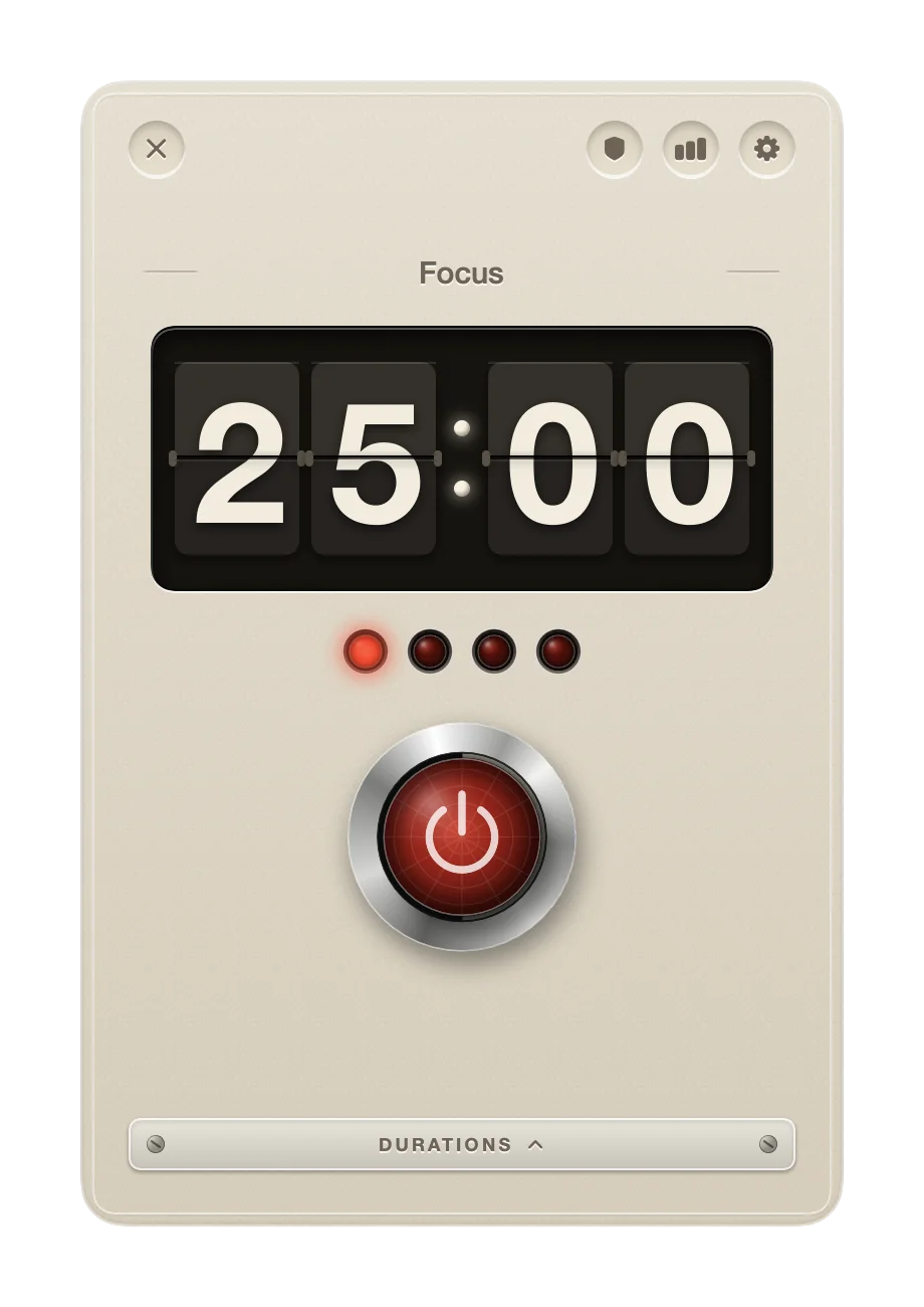
The appliance is on the right. An enamel housing, a display that flips, four lamps and one red button. The rest of this leaflet explains where the idea came from, what the people who did it first understood, and how it is carried through, part by part.
What skeuomorphic means
The word is built from two Greek roots: skeuos, a vessel or a tool, and morphē, form. A skeuomorph is an object that keeps the shape of the thing that came before it, after the reason for that shape has gone. The moulded stitching on a plastic car dashboard is one. The shutter click a phone makes when it takes a picture is another. Nothing in the phone needs to click; the sound is kept because it tells you the picture was taken.
In software the word means controls that look and behave like the physical ones they stand in for. A button has depth and gives when pressed. A switch slides. A page turns at the corner. The practice is older than the word's fame. The Macintosh desktop of 1984 had folders and a trash can, and nobody needed a manual to guess what they did. Mac OS X's Aqua interface, shown in 2000, had buttons that Steve Jobs said looked good enough to lick. Then came the iPhone years, from 2007 to 2012, when Apple's own apps wore leather and stitching in Calendar and Contacts, a wooden shelf in iBooks, green felt in Game Center, a yellow legal pad in Notes and a tape reel in Podcasts.
In 2013, iOS 7 flattened all of it. The leather went, the felt went, and most of the industry followed within a year or two. Flat design is quicker to draw and reads well on any screen. It is also the reason every timer now looks like every other timer.
What that Apple understood
A control that looks like a thing tells you what it does before you touch it. A raised button asks to be pressed. A knob on a slot asks to be slid. A lamp is either on or off, and you can read it from across the room. Texture and depth carry information: a dark well says the display is set into the housing, and a shadow under a cap says the cap can move. The eye works this out faster than it reads a label.
The second thing that Apple understood is that an object can be liked. People kept those leather and felt apps open because they were pleasant to look at, and a tool you like is a tool you keep using. Pleasure is a fair thing to ask of something you look at for twenty-five minutes at a stretch.
Pomo is a tribute to that idea, made with today's tools. The housing, the cards, the lamps and the button are drawn in SwiftUI with gradients and shadows, and the page curl in the leaflet is a Metal shader. Every part is drawn in code rather than photographed, and the tribute copies no single Apple screen. It is in the thinking: a control should look like what it does, and the result should be worth looking at.
The appliance, part by part
Here is what that thinking produced, from the outside in.
- The housing. Eggshell enamel with a seam around the edge and a faint grain over the whole, the finish a kitchen appliance had before plastics took over. A one-pixel highlight runs along the top edge and a soft shadow sits under the bottom.
- The display. Four split-flap cards set into a dark recessed well. When a digit changes, its card folds down and the new digit is beneath it. The display has a leaflet of its own.
- The lamps. Four jewels in thin metal bezels, one for each session in the cycle. A lamp lights when its session is done and pulses slowly for the one under way. All four turn green for the break.
- The button. One big push button with a brushed bezel and a convex cap. The cap drops when pressed and stays down. It is red while focusing and green on a break.
- The nameplate. An engraved plate carries the session title, so the record shows what the time went on.
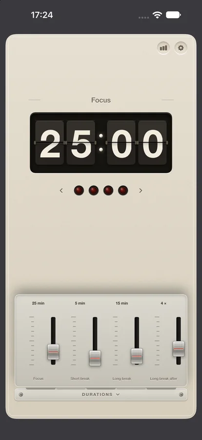
- The Durations door. A small door marked Durations opens on four faders on tick-mark scales: focus, short break, long break, and the number of sessions before the long one. The faders are built after the slide controls of analogue hi-fi and turntable gear from the 1970s, and they move the way those did.
The tomato of the Pomodoro method lives only in the lamps and the button cap. Everything else is quiet.
The printed matter
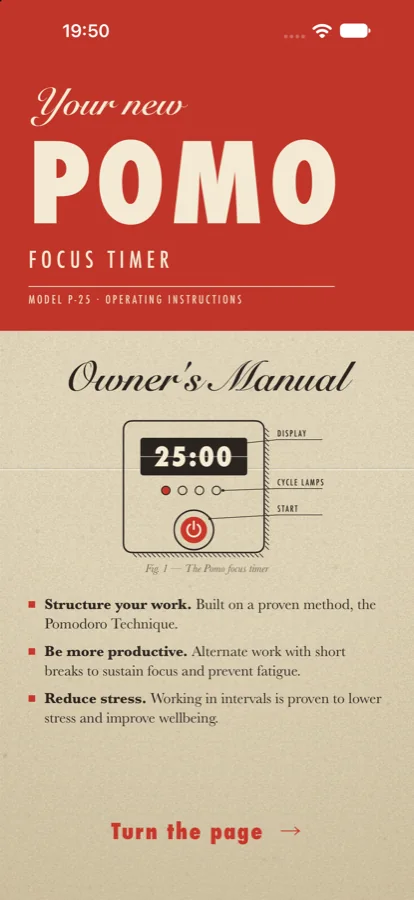
An appliance comes with an owner's manual, so everything the owner reads in Pomo is set like one. Two colours on cream paper. Numbered figures with captions beneath them. A form number at the foot of each page, and red circled numerals where a step needs pointing at.
The first-run leaflet uses it; the first page is shown in Fig. 3. The record of use is printed the same way, a ledger of sessions by day, week, month and year. The App Store screenshots are set on the same paper, and so is this website, down to the form number at the bottom of this page. One voice for everything the owner reads.
One rule keeps the two halves apart. The hardware looks like hardware and the paper looks like paper. A control on a page is a printed link, set in the ink of the page. It is never drawn as an appliance button, because a button on paper would be a lie, and the whole point of the design is that nothing on it lies about what it does.
Rules we set ourselves
Six rules, kept on every screen. They are the reason the appliance holds together.
- Ornament must do work. Every texture tells you something: the well says depth, the shadow says the cap moves, the glow says the lamp is on. A texture that says nothing is removed.
- One accent colour. Tomato red, and green for a break. The housing itself carries no colour.
- The display is the memorable part. The rest stays quiet so the flipping digits are what you remember.
- Hardware looks like hardware, paper looks like paper. The two never borrow from each other.
- It must run as fast as a flat app. A flip takes about 180 milliseconds, and the lamps and shadows cost almost nothing to draw.
- Nothing is a photograph. Everything is drawn in code, so it is sharp at every size, on the Watch and on the Mac alike.
Pomo is free on Mac, iPhone, iPad and Apple Watch. The Mac leaflet describes the menu bar timer and the blocker, and the press kit has the pictures at full size. For more on the display, see the split-flap leaflet.